

Porter Gothic
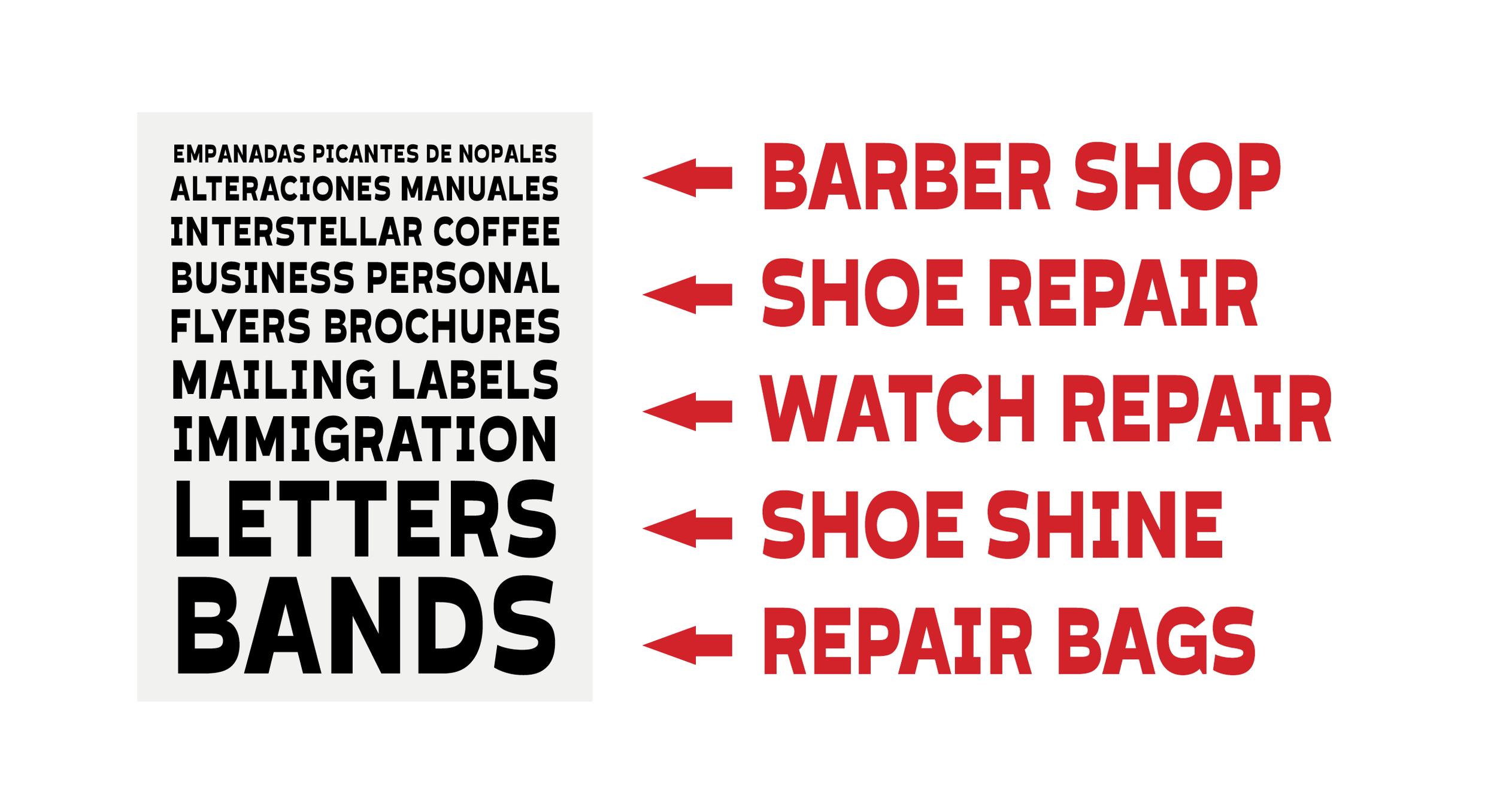
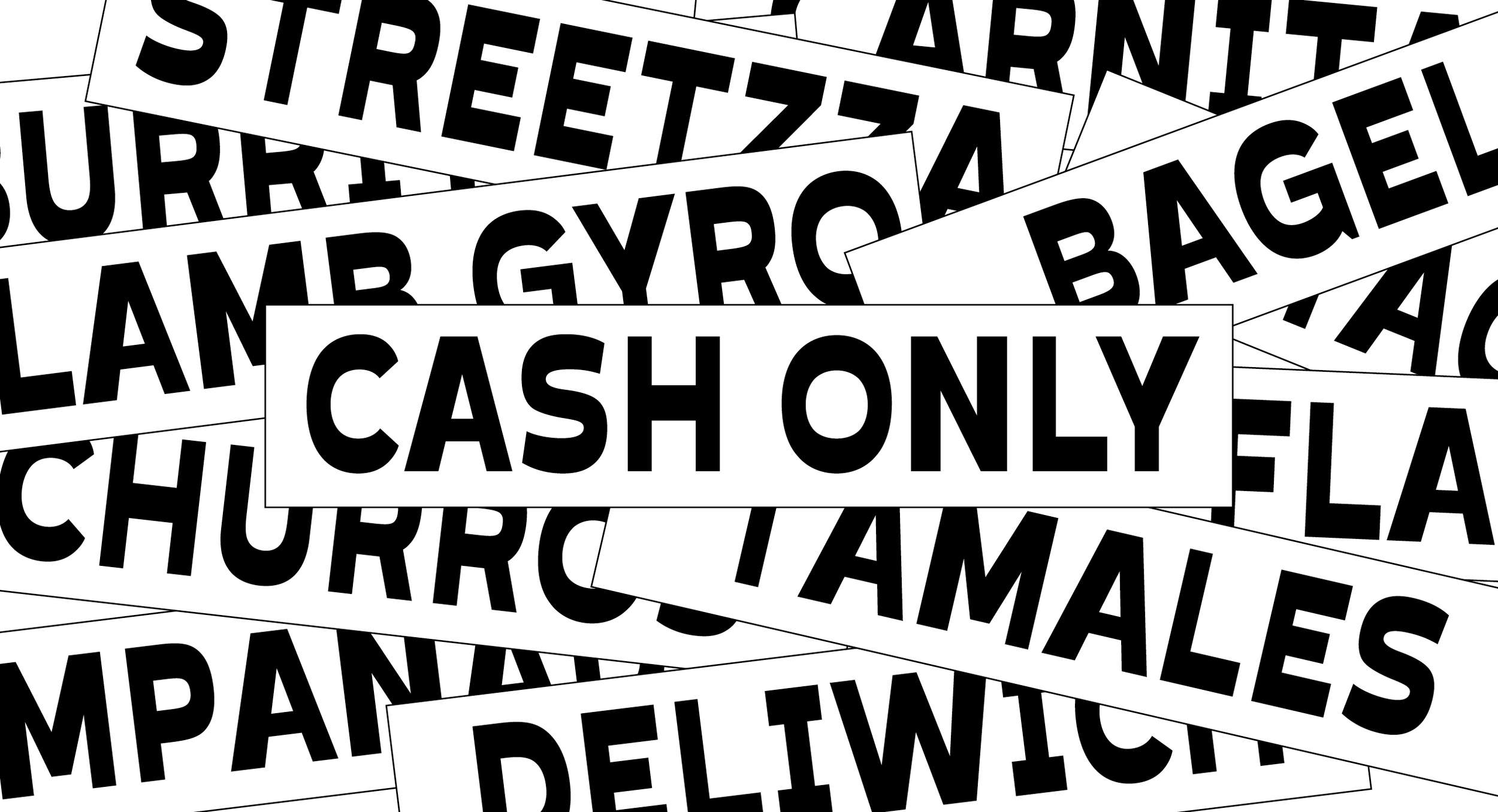
Porter Gothic is an exploration on vernacular NYC typography. The inspiration comes from the street signage seen on window displays of laundromats, tailoring shops, and store awnings. I was captivated by the fact that many of these businesses tend to squeeze the type on their displays to fit as many words a possible. This often results on unintended horizontal stress because the letters get narrow but are not optically balanced. To most people, these signs are part of everyday life and go unnoticed. Informed by the “decisions” made by naive typographers, I saw this as an opportunity to learn from it and design something with intent.


PORTER
Porter Gothic is an exploration on vernacular NYC typography. The inspiration comes from the street signage seen on window displays of laundromats, tailoring shops, and store awnings. I was captivated by the fact that many of these businesses tend to squeeze the type on their displays to fit as many words a possible. This often results on unintended horizontal stress because the letters get narrow but are not optically balanced. To most people, these signs are part of everyday life and go unnoticed. Informed by the “decisions” made by naive typographers, I saw this as an opportunity to learn from it and design something with intent.